Red Amber Green in dashboards
- Mark as New
- Bookmark
- Subscribe
- Mute
- Subscribe to RSS Feed
- Permalink
- Report Inappropriate Content
07-27-2016 03:48 AM
Hi everyone,
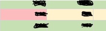
I am trying to represent values in a table, using Red Amber Green, based on some conditions, like it can be seen below:

Can someone please help me implement this?
Best regards,
Oana
- Labels:
-
Performance Analytics
- Mark as New
- Bookmark
- Subscribe
- Mute
- Subscribe to RSS Feed
- Permalink
- Report Inappropriate Content
07-27-2016 07:31 AM
You're probably looking at field styles: Defining Field Styles - ServiceNow Wiki
In the current UI I don't think you can do cell fills. I think they traded that for colored dots beside the data.
- Mark as New
- Bookmark
- Subscribe
- Mute
- Subscribe to RSS Feed
- Permalink
- Report Inappropriate Content
07-27-2016 11:45 PM
Hi Robert,
Thank you for your reply. I was trying to add targets (3 color traffic light) in order to highlight the values, but I am not sure how to add color dots beside the data, like you suggested.
- Mark as New
- Bookmark
- Subscribe
- Mute
- Subscribe to RSS Feed
- Permalink
- Report Inappropriate Content
07-28-2016 06:21 AM
The dots happen automatically when you define a field style that changes the color.
