Setting a scale on bar charts
- Mark as New
- Bookmark
- Subscribe
- Mute
- Subscribe to RSS Feed
- Permalink
- Report Inappropriate Content
03-29-2021 03:10 PM
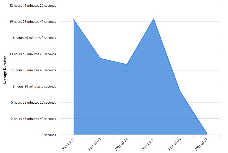
I understand that I'm not the first to ask this question- but how can I scale my y/x axis to meet the needs of my data. Whether this be using the 'group by' option to reduce the number of bins I want to show or to produce a graph with less precise/more generic labels (see screenshot below) - Thanks.

- Labels:
-
Reporting
- Mark as New
- Bookmark
- Subscribe
- Mute
- Subscribe to RSS Feed
- Permalink
- Report Inappropriate Content
03-29-2021 03:40 PM
Hi,
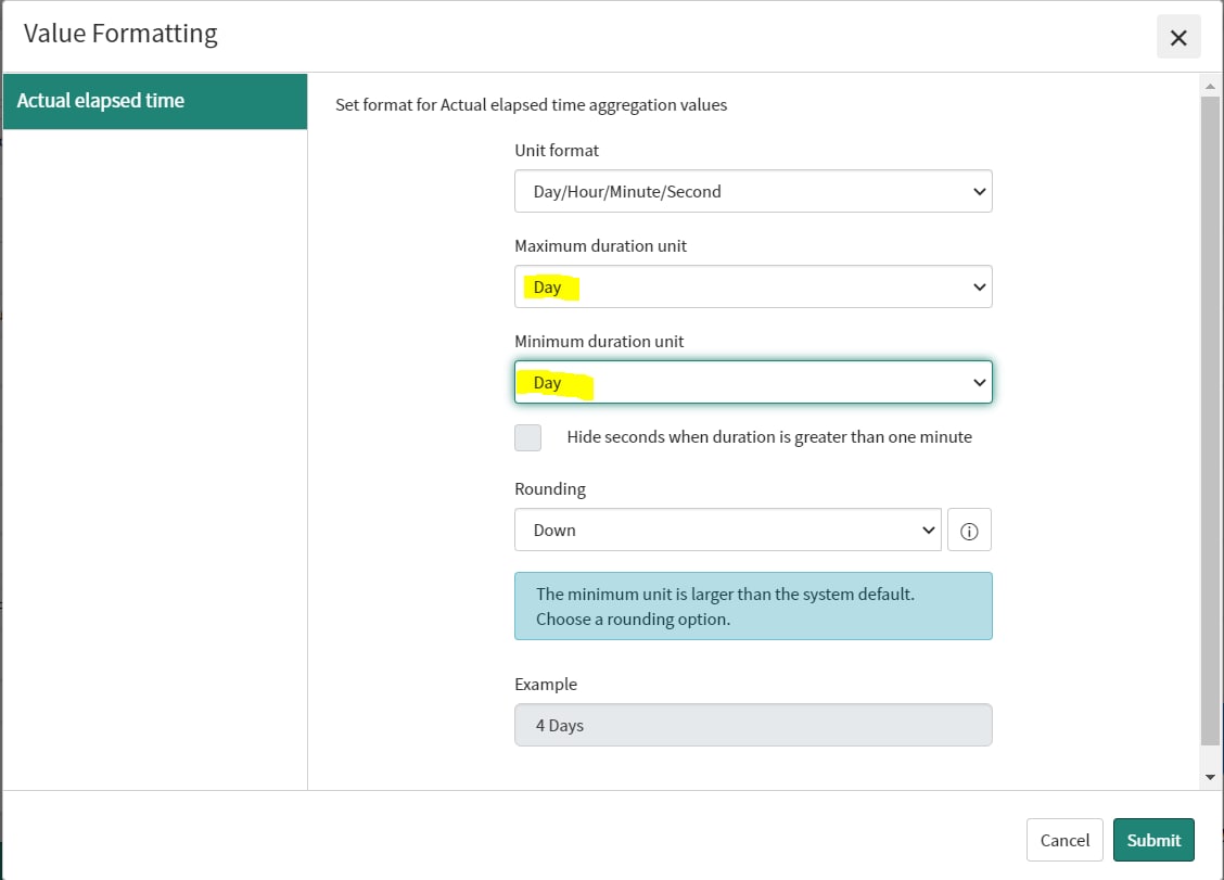
In Quebec, there is a "set value formatting" option on the "configure" tab of the report editor.
By using this, you can reduce the precision of the y axis to get a less chaotic graph.
So you can go from this:

And set both the minimum and maximum values to "day":

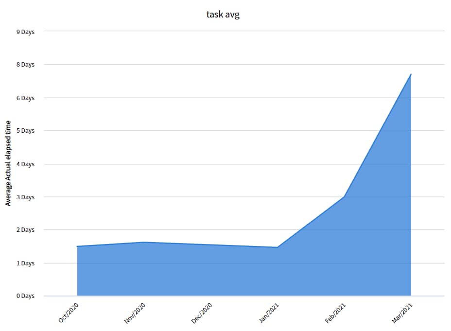
And you'll end up with a simpler y axis:

As for the x axis, if you use a trend chart and instead of grouping by date you trend by date (and group by none), you can get the averages per month/week/year instead of a daily value:

Altogether, the changes make the report much better looking:

- Mark as New
- Bookmark
- Subscribe
- Mute
- Subscribe to RSS Feed
- Permalink
- Report Inappropriate Content
03-30-2021 07:03 AM
Thanks for the reply- I apologize I made an error- we are only about to upgrade to the Paris version. Will this same feature exist in this release?
- Mark as New
- Bookmark
- Subscribe
- Mute
- Subscribe to RSS Feed
- Permalink
- Report Inappropriate Content
03-30-2021 07:36 AM
No worries. In the Paris version the "set value formatting" option does not exist unfortunately. If you want to format the value on the Y axis, you can use Performance Analytics in which you are able to specify the value format of an indicator as either minutes, hours of days (or any other unit you want). You are entitled to PA if you are running ITSM Pro or Enterprise. In general, PA provides much better control of the data and I would recommend using it at least as a complement to your reports.
If you don't have access to PA, you have to modify the record data instead as the report application will not allow the kind of value format you want. For example, you could add a field denoting the value you are reporting on for each record in hours or days, and the average that field in a report.
As for the X axis, the reporting application in Paris will allow you to trend by month/week/day year as suggested in my post above, that is not new in Quebec.