


Adam Stout

ServiceNow Employee
Options
- Subscribe to RSS Feed
- Mark as New
- Mark as Read
- Bookmark
- Subscribe
- Printer Friendly Page
- Report Inappropriate Content
10-02-2018
12:46 PM
Almost everyone now is walking around with a watch, phone, or fitness tracker that keeps tabs on how many steps they walked each day. These devices all collect and save your measurements on a minute by minute basis, but the apps and reports are often designed to show how your activity is progressing compared to last week, last month, or last year. It’s one thing to see if you were more active at noon versus 10 am, but what you really want to know is if you’re continuing to improve over time. Aggregating your steps into weekly, monthly, and yearly scores gives you an easier way to identify trends in your activity.
Performance Analytics is no different — while daily scores are foundational and almost always desired, there are certain scenarios where we also need to have the scores available by week, month, or quarter. In other cases, we need to have a month/quarter/year-to-date number that shows cumulative progress up until the current point. Instead of defining multiple indicator sources and indicators to track each unique interval, Performance Analytics natively allows you to capture the data once and then adjust the view for any of these scenarios:
- Aggregate the data to a less frequent period
- Smooth the data with a rolling average
- Determine a period-to-date score
Keep in mind that while daily indicators can be aggregated with any time series, indicators collected on a weekly basis cannot be aggregated with a monthly/quarterly/yearly format because weeks do not evenly fit into those periods.
Let’s walk through why you may want to use them and how to create an indicator that can be used with various time.
When to Apply a Time Series
Daily data is very useful in many cases, but there are situations where applying a time series to aggregate the data gives additional context about your performance. Performance Analytics offers four different types of time series you can use, but it’s important to understand when you would want to use each type:
| Type | Example | Use Case |
|---|---|---|
| Running | 28d running | Smooths out spikes in the data to make trends easier to spot. For example, looking at daily incident counts may show a drop every weekend, but a 7-day running average smooths out those drops. |
| 30d running | ||
| 7d running | ||
| 12m running | ||
| 3m running | ||
| 6m running | ||
| 13w running | ||
| 4w running | ||
| 4q running | ||
| To Date | Fiscal quarter-to-date | Shows cumulative scores for the period. This is very useful if you have a monthly target to hit, but you need to also see the velocity throughout the month. |
| Fiscal year-to-date | ||
| Month-to-date | ||
| Quarter-to-date | ||
| Week-to-date | ||
| Year-to-date | ||
| By Period | By week | Shows the cumulative scores for entire periods. While we may want to track the number of P1 incidents daily, the frequency is too low to have a daily target. Instead, we can set a target at the month level with a "By Month” time series. The current period will never appear in the results because it is incomplete. |
| By month | ||
| By fiscal quarter | ||
| By quarter | ||
| By fiscal year | ||
| By year | ||
| By Period (Including Partial) | By week + | The “+” version of the “By” Time Series includes partial periods so there will be a score for the current period. There is more explanation about this in the documentation. |
| By month + | ||
| By fiscal quarter + | ||
| By quarter + | ||
| By fiscal year + | ||
| By year + |
Examples
Here are examples of most of the time series applied to a single daily indicator. Notice how the exact same data is used, but there is a clear difference in the scores and in the charts.
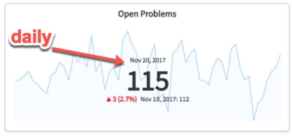
Daily scores
The following Time Series will have scores for every day as long as the base indicator is collected daily:
Weekly, monthly, quarterly, and yearly scores
These time series will only have a score for each period (whether week/month/quarter/year), and there is no score for each day in the period.
Applying a time series
Configure the indicator source
When you define an indicator source, you specify the frequency which that score will be valid. You will want to choose the smallest frequency that will be needed. For instance, if we want to track number of new users per month (and never want to see the number of new users per day), we would select a monthly frequency. The monthly data can then be displayed as its native monthly number, or as a quarterly or yearly value by applying a time series. Most often, we will select a daily frequency because it is the most flexible. Automated indicators based on this indicator source will only be valid for this frequency.
You will also want to ensure that the conditions on the indicator source match the frequency. For example, a daily indicator source will normally have a condition similar to this one on “Incidents.New”:
Configure the indicator
There is nothing special that needs to be done on the indicator itself to allow a time series to be applied, but you can optionally exclude some time series if they are not valid for the indictors. For example, if your indicator is not valid until the period is fully complete, you may want to exclude the partial period time series (those with the + at the end). For automated indicators that use averages, you may want to exclude all AVG Time Series to avoid taking averages of averages.
Note: If you’re displaying an average, we recommend using a formula indicator that calculates the average value from two individual, automated indicators (a sum and a count).
Apply a time series in a scorecard
You can apply any valid time series on the Detailed Scorecard by selecting the time series in the top-right corner of the scorecard. Here is the same scorecard shown as a daily score and then with the “By week SUM” time series applied:


Apply a time series to a widget
In addition to the Detailed Scorecard, you can apply a time series to a dashboard widget within the widget configuration screen:
Here we can see the same widget showing the data with and without a time series applied:
Here is a single score with a "By Month" time series applied and the originally daily screen.
The full user documentation for time series can be found at: https://docs.servicenow.com/bundle/london-performance-analytics-and-reporting/page/use/performance-a...
Labels:
- 24,166 Views
6 Comments
You must be a registered user to add a comment. If you've already registered, sign in. Otherwise, register and sign in.
