- Mark as New
- Bookmark
- Subscribe
- Mute
- Subscribe to RSS Feed
- Permalink
- Report Inappropriate Content
07-19-2019 09:58 AM
Hmm...when drafting a question, there's no option to choose Kingston as the version, but that's what we're on (for now).
Hello!,
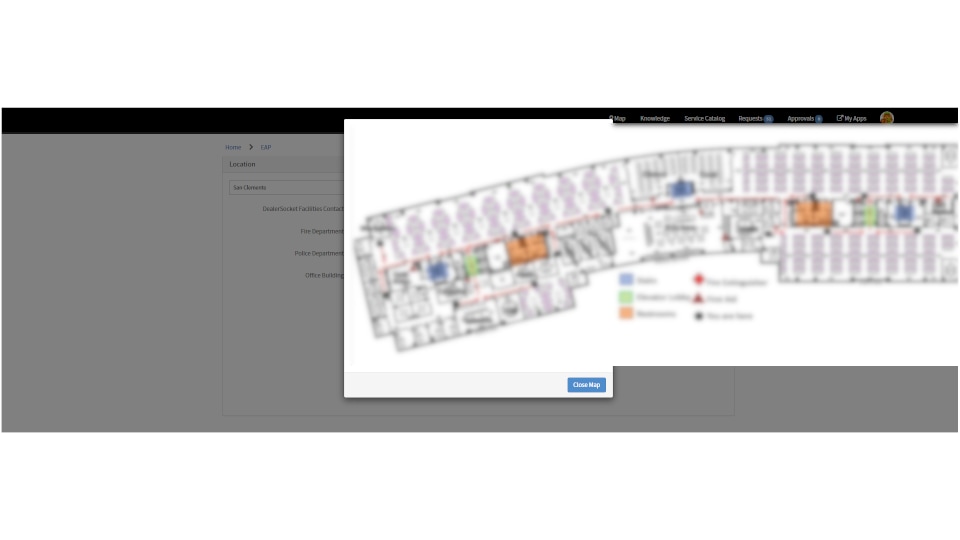
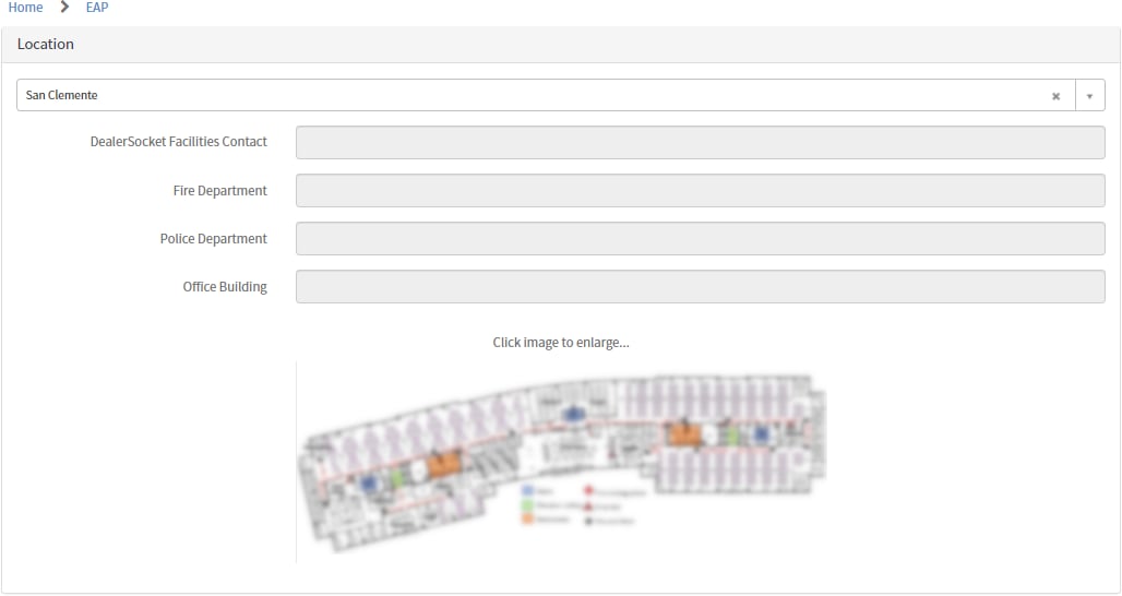
I'm trying to get an image to pop up in a modal/lightbox on the service portal, but I can't seem to get it to display correctly. I'd like to use the width of the browser window, and not be limited by the narrow bootstrap container, as this is for displaying floor plan images and some of are hard to read when sized down to fit. I have a thumbnail that on-click should pop a full-size image (or at least span the window). Currently the modal remains narrow, but the image is left-justified to the modal and the right side breaks out of the window. Clearly this is not ideal (see below).
I found the serviceportal.io - 'Modal Windows in Service Portal' article of how to use uibModal, and am trying to adapt it to fit my needs. I've read several posts here and elsewhere about resizing a modal window, and most are just referencing that same how-to, so I'm not getting very far.
I'm not very familiar with how these HTML components work together, so hopefully it's just something silly that I'm overlooking. My HTML knowledge is pretty outdated and there was no "bootstrap" when I fiddled with it in college.
Here's the HTML section I'm using for my thumbnail and the modal:
<div class="panel-body">
  <center>
    <p>
      Click image to enlarge...
    </p>
    <img src="{{data.loc.u_evac_map}}" width="50%" ng-click="c.openModal()" />
  </center>
</div>


<script>
  <div class="panel panel-default" width="140px">
    <div class="panel-body">
      <img src="{{data.loc.u_evac_map}}" width="1400px" /> <!--Testing different widths here-->
    </div>
    <div class="panel-footer text-right">
      <button class="btn btn-primary" ng-click="c.closeModal()">${Close Map}</button>
    </div>
  </div>
</script>
Client Script portion for modal (unchanged from the article example):
c.openModal = function() {
  c.modalInstance = $uibModal.open({
    templateUrl: 'modalTemplate',
    scope: $scope
  });
}

c.closeModal = function() {
  c.modalInstance.close();
}
And here is how it all displays in SP, both the thumbnail and resulting modal (images blurred to protect the innocent):


Any thoughts on how I can adjust this to be centered and full width? I suppose I don't need the standard modal window background (is that "panel"?), but am not sure how to manipulate this, or if perhaps there's another solution altogether that I'm just not aware of. Any input here would be great.
Solved! Go to Solution.
- Labels:
-
Multiple Versions
-
Service Portal
- Mark as New
- Bookmark
- Subscribe
- Mute
- Subscribe to RSS Feed
- Permalink
- Report Inappropriate Content
07-22-2019 04:16 PM
I'm not sure that I understand your problem correctly.
The first picture, which you post looks like some page and widget with
<img src="" width="50%" ng-click="c.openModal()" />included in Body HTML Template of the widget. Is it so?
Now you want to display modal dialog with some content if user clicks on the image. The code could be about the following
spModal.open({
	title: "It's öarge image",
	size: "lg",
	message: "<img src='https://...' style='max-width:1370px' />",
	buttons: [{
		label:  "Click here to close",
		primary: true
	}]
});
(you can use $uibModal if you like it more, but spModal is just a wrapper to $uibModal)
The parameter size: "lg" means that created modal will contains classes "modal-dialog modal-lg" (with "lg"). There are exist CSS rule
.modal-lg {
    width: 900px;
}
in Bootstrap CSS. If you need to use another width width you can use any other string value for the size parameter, for example size: "custom". As the result the dialog will be created with the classes "modal-dialog modal-custom". So you will need just add CSS rule
.modal-custom {
    width: 1400px;
}
on the page, where you use the widget or on the theme of portal (not in CSS of the widget, because modal will be appended to body and not to the div of the widget):

After that the popup dialog will have width 1400px.
- Mark as New
- Bookmark
- Subscribe
- Mute
- Subscribe to RSS Feed
- Permalink
- Report Inappropriate Content
07-22-2019 03:01 PM
Is anyone out there handy with modal windows in SP?
- Mark as New
- Bookmark
- Subscribe
- Mute
- Subscribe to RSS Feed
- Permalink
- Report Inappropriate Content
07-22-2019 04:16 PM
I'm not sure that I understand your problem correctly.
The first picture, which you post looks like some page and widget with
<img src="" width="50%" ng-click="c.openModal()" />included in Body HTML Template of the widget. Is it so?
Now you want to display modal dialog with some content if user clicks on the image. The code could be about the following
spModal.open({
	title: "It's öarge image",
	size: "lg",
	message: "<img src='https://...' style='max-width:1370px' />",
	buttons: [{
		label:  "Click here to close",
		primary: true
	}]
});
(you can use $uibModal if you like it more, but spModal is just a wrapper to $uibModal)
The parameter size: "lg" means that created modal will contains classes "modal-dialog modal-lg" (with "lg"). There are exist CSS rule
.modal-lg {
    width: 900px;
}
in Bootstrap CSS. If you need to use another width width you can use any other string value for the size parameter, for example size: "custom". As the result the dialog will be created with the classes "modal-dialog modal-custom". So you will need just add CSS rule
.modal-custom {
    width: 1400px;
}
on the page, where you use the widget or on the theme of portal (not in CSS of the widget, because modal will be appended to body and not to the div of the widget):
After that the popup dialog will have width 1400px.
- Mark as New
- Bookmark
- Subscribe
- Mute
- Subscribe to RSS Feed
- Permalink
- Report Inappropriate Content
07-25-2019 11:12 AM
Hi Oleg,
Thanks for your response. You are correct about my intent with the HTML section.
I had tried some of what you proposed, but the piece that seemed to make the big difference was setting the CSS within the page and not the widget itself.
Thanks for getting me on the right track!