- Mark as New
- Bookmark
- Subscribe
- Mute
- Subscribe to RSS Feed
- Permalink
- Report Inappropriate Content
08-20-2025 11:18 AM
Hi everyone, how are you?!
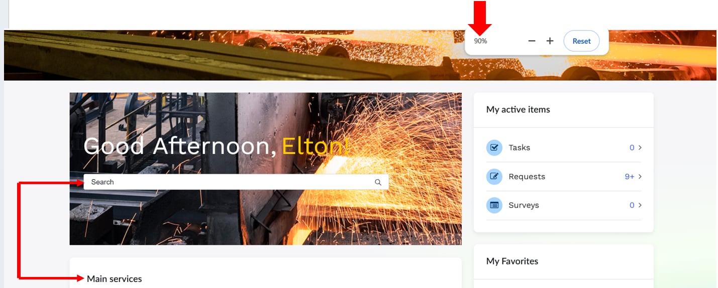
I created a banner and embedded the "Typeahead Search" widget (img-1).
When zoomed in at 100%, "Typeahead Search" aligns with the "Quick Links" container (img-2). However, when zoomed in at less than 100%, it becomes misaligned (img-3) or greater than 100% (img-4).
I ran a test here and it would be possible to include the "banner" in the same container as the "Quick Links" (img-5), this way, it wouldn't be misaligned even when zooming in or out (img-6). However,
this isn't the way the client wants it.
Note: The problem is that "Relative" or "Absolute" positioning doesn't work in this case, as
they are different containers.
HTML:
<div class="gdu-banner-image" style="background-image:url('{{data.image}}');">
<div class="gdu-greeting-name">
<div class="gdu-greeting">{{::data.greeting}}, </div>
<div class="gdu-name">{{::data.name}}!</div>
</div>
<div class="gdu-search">
<widget id="typeahead-search"></widget>
</div>
</div>
CSS:
Solved! Go to Solution.
- Mark as New
- Bookmark
- Subscribe
- Mute
- Subscribe to RSS Feed
- Permalink
- Report Inappropriate Content
08-20-2025 11:28 AM
@Elton2 , Try this and tell me if it is working right.
Updated code.
<div class="gdu-banner-image" style="background-image:url('{{data.image}}');">
  <div class="gdu-banner-content">
    <div class="gdu-greeting-name">
      <div class="gdu-greeting">{{::data.greeting}}, </div>
      <div class="gdu-name">{{::data.name}}!</div>
    </div>

    <div class="gdu-search">
      <widget id="typeahead-search"></widget>
    </div>
  </div>
</div>
.gdu-banner-image {
  display: flex;
  align-items: flex-start;
  justify-content: center;
  width: 100%;
  height: 300px;
  padding: 70px 60px; /* replaces absolute top/left */
  background-repeat: no-repeat;
  background-size: cover;
  background-position: center;
  box-sizing: border-box;
}

.gdu-banner-content {
  display: flex;
  flex-direction: column;
  gap: 30px; /* space between greeting and search */
  width: 100%;
  max-width: 800px; /* controls how wide the search can go */
}

.gdu-greeting-name {
  display: flex;
  gap: 8px;
}

.gdu-greeting {
  color: #FFF;
  font-size: 3rem; /* scalable instead of 48px */
}

.gdu-name {
  color: #FFCC00;
  font-size: 3rem;
}

.gdu-search {
  width: 100%; /* responsive width */
}
Shashank Jain
- Mark as New
- Bookmark
- Subscribe
- Mute
- Subscribe to RSS Feed
- Permalink
- Report Inappropriate Content
08-21-2025 12:03 PM - edited 08-21-2025 12:04 PM
@Elton2 , I'm happy this helped😀!
Just a little explanation :
Use absolute + px → only if you’re placing something very specific (like icons on top of an image).
For text, forms, widgets → always prefer flexbox, grid, %, rem, padding/margin → so things scale consistently.
If this explanation is understandable, please mark it as accepted so future readers can also benefit from both the explanation and the working code.
Shashank Jain
- Mark as New
- Bookmark
- Subscribe
- Mute
- Subscribe to RSS Feed
- Permalink
- Report Inappropriate Content
08-20-2025 11:28 AM
@Elton2 , Try this and tell me if it is working right.
Updated code.
<div class="gdu-banner-image" style="background-image:url('{{data.image}}');">
  <div class="gdu-banner-content">
    <div class="gdu-greeting-name">
      <div class="gdu-greeting">{{::data.greeting}}, </div>
      <div class="gdu-name">{{::data.name}}!</div>
    </div>

    <div class="gdu-search">
      <widget id="typeahead-search"></widget>
    </div>
  </div>
</div>
.gdu-banner-image {
  display: flex;
  align-items: flex-start;
  justify-content: center;
  width: 100%;
  height: 300px;
  padding: 70px 60px; /* replaces absolute top/left */
  background-repeat: no-repeat;
  background-size: cover;
  background-position: center;
  box-sizing: border-box;
}

.gdu-banner-content {
  display: flex;
  flex-direction: column;
  gap: 30px; /* space between greeting and search */
  width: 100%;
  max-width: 800px; /* controls how wide the search can go */
}

.gdu-greeting-name {
  display: flex;
  gap: 8px;
}

.gdu-greeting {
  color: #FFF;
  font-size: 3rem; /* scalable instead of 48px */
}

.gdu-name {
  color: #FFCC00;
  font-size: 3rem;
}

.gdu-search {
  width: 100%; /* responsive width */
}
Shashank Jain
- Mark as New
- Bookmark
- Subscribe
- Mute
- Subscribe to RSS Feed
- Permalink
- Report Inappropriate Content
08-20-2025 12:39 PM
Hi @Shashank_Jain , how are you?!
Yes!!! 😉
I tested it here and it's working!
Thank you so much for the tips, they were great for expanding my knowledge.
Thank you so much again!!!
- Mark as New
- Bookmark
- Subscribe
- Mute
- Subscribe to RSS Feed
- Permalink
- Report Inappropriate Content
08-21-2025 12:03 PM - edited 08-21-2025 12:04 PM
@Elton2 , I'm happy this helped😀!
Just a little explanation :
Use absolute + px → only if you’re placing something very specific (like icons on top of an image).
For text, forms, widgets → always prefer flexbox, grid, %, rem, padding/margin → so things scale consistently.
If this explanation is understandable, please mark it as accepted so future readers can also benefit from both the explanation and the working code.
Shashank Jain
- Mark as New
- Bookmark
- Subscribe
- Mute
- Subscribe to RSS Feed
- Permalink
- Report Inappropriate Content
08-22-2025 06:01 AM
Hi @Shashank_Jain , how are you?!
Yes! Thanks again for this explanation!!!
I'll use all these tips
Thanks 😉