Pivot tables show multiple dimensions or variables of a data set. This visualization displays separate cells for each row and column value combination, as well as a column subtotal for each first-level row. Aggregate
information is presented in the top left of the chart.
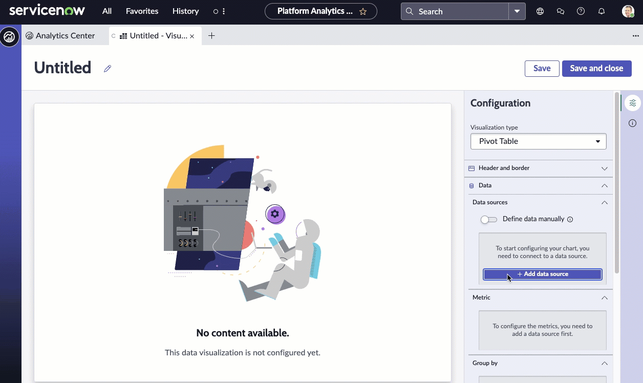
Before you begin
Role required: Anyone with access to data can create a visualization of that data on any dashboard that they can edit. Users with the itil, report_user, admin, or viz_creator role can create a visualization in the Visualization Designer. If you create a visualization in the Visualization Designer, it is saved to the Library. For more information on access, see Report_view access control and Platform Analytics roles.
About this task
Use this visualization type to show multiple variables in a single chart. It can be useful for showing the relationship between different variables. In this example, you look at closed incidents grouped by assignment group,
priority, and location.
Procedure
-
Follow the first steps of Create a pivot table visualization in the Visualization Designer:
-
Navigate to .
-
Select New.
-
Select the Pivot Table (
 ) visualization type.

-
For the moment, skip the header and border section and move to the data source.
-
Select Add data source.
-
Choose the Incident [incident] table.
-
Because this visualization shows completed incidents, let's add the Incidents.Closed condition in the Filters section.
With this filter selected, the visualization only shows the non-active incidents.
- Optional:
Select Run to preview the records that the visualization will be based on.
-
Select Add this source.
A pivot data visualization with the current value of the selected data appears in the
Visualization Designer. Because the only information you've given is that the visualization represents closed incidents, you see only
a single row. You add columns and rows in the next step.
-
Now that you can see the visualization, let's add some context for the user.
-
Expand the Header and border section.
-
Select Show header and provide the chart title Completed incidents - Priority, Location and Assignment Group.
When Show header is selected, you can add a title and a description. The chart title isn't necessarily the same as the visualization name. The visualization
name identifies it in the Visualization Designer and in a list. The chart title appears within the visualization.
-
Enter a description of the visualization: Closed incidents of all assignment groups grouped by priority and location.
While the description and title fields aren't required, this information makes the visualization easier to understand on a dashboard and easier to identify in a list.
-
Select Save and give the report the title Pivot - Closed incidents.
-
Skip the Metric section.
-
Under Group by, add one column and multiple rows to show the data from multiple perspectives.
-
Add the Assignment group column to show the top level of information.
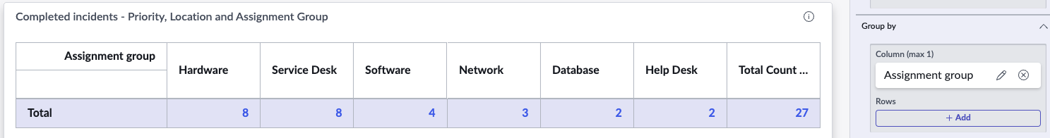
-
Add two rows: Priority and Location.
-
Show all totals.
- Show row total provides the total count for each row in a new column.
- Show column total provides the total for each column in a new row.
- Show parent row totals shows the totals in each top level row of the elements below it. For example, there are three Critical Hardware incidents, one each in three different locations.

-
Under Sorting, choose the field to sort by and the order of the sorting.
-
Choose to sort by Name.
The priority names each start with a number so they appear in the order 1 - Critical, 2 - High, 3 - Moderate, and so forth.
-
Choose Ascending for the sort order.
The bars are ordered with 1 - Critical at the top followed by 2 - High, 3 - Moderate, and so forth. In addition, the locations also appear in alphabetical order.

-
Under Data update, configure how the audience interacts with the visualization.
-
Select Follow filters.
This option enables the visualization to follow interactive filters on the dashboards it's placed on that are based on the same table.
-
Select Show filter icon to show the number of filters applied to the visualization.
For example, if dashboard filters limit the value of the visualization, the icon indicates that you're seeing the number of open incidents that match the filters. You can then check to see which filters are in
effect.
-
Select Enable drilldown to let viewers navigate to relevant information by selecting a data point in the chart.
Some visualizations only drill down to the list of associated data. Table data is generally restricted by access control lists (ACLs) and viewers may not see all of the associated records.
This control mirrors
Allow chart interaction. Under Chart Interaction, you can also select the destination of drilling down.
-
Play with the display settings.
The settings in this section enable you to make the table easier to read with frozen rows and columns, lines and shading for rows and columns, and expanding or contracting the table when it's first viewed.
-
Play with the color settings.
From Set color type, choose Single color to enable setting background colors and configuring color rules.
-
Configure a color rule for the visualization.
This example deals with closed incidents, but in the case of open incidents, you want to define a dynamic color rule that changes the score's color based on its value.
-
Under Color Rules, select + Add rule.
-
For the first color rule, choose the Operator
lower than, enter the Value
6, and choose the color Green, and select Apply.
The value is up to the specified number but not including it.
Retain the order 100.
-
To indicate a value that requires more attention, create a second rule with the Operator
between, the values 5 and 25, the color and icon color Warning Orange, and the order 50.
-
To show values that require the highest attention, create a third rule with the Operator
greater than, the value 25, the color and icon color Red, and the order 25.
You've created three rules to show whether the value is in line with what you want to see.
Note: Color rules only apply to the individual values, not to the total columns and rows which retain the specified color and
background color.