Chart options for multiple metrics
If you are showing multiple metrics in a data visualization, you can set the visualization type and the Y-axis scale for each metric. If you have the latest Data Visualizations application installed from the ServiceNow Store, you can also have filters on a dashboard apply only to specific metrics.
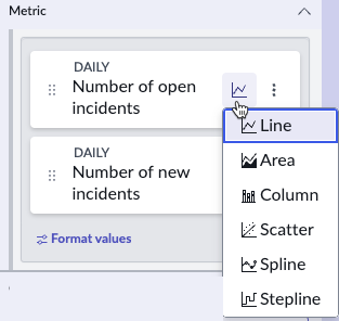
When you have a data visualization with more than one data source, you have a separate metric for each data source. In time series data visualizations, you can select a separate chart type for each metric, to make the chart easier to
read. In each Metric tile, selecting the chart icon opens a list of chart types to choose from.
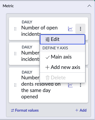
In some time series, the difference between the range of values of metrics makes it difficult to read the metrics when they share the same Y-axis scale. In this case, you can have separate Y-axis scales for the metric. Add a Y-axis for
a metric by selecting the More options icon in the metric tile. Be sparing with this function, however, because having too many Y-axis scales also makes the chart difficult to read. Also, be sure to give a short but clear label for each
Y-axis if you have more than one.
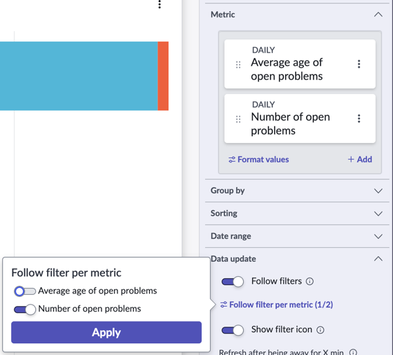
If Follow filters is activated on a time series or bar visualization that shows multiple metrics, the configuration panel shows an expandable item called Follow filters per metric. Expand this item to toggle filter following on or off for each metric.
For example, consider a bar visualization that shows the Number of open problems and the Average age of open problems. You can configure this visualization so that the Number of open problems follows any
applicable filters on a dashboard, but the Average age of problems does not.
Important:
The option to follow filters per metric is included in the latest Data Visualizations application from the ServiceNow® Store.