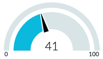
Like dials, gauges show where a single value lies across a range from minimum to maximum expected values. In addition to dial functionality, you can set colored data ranges to help users
understand what the value represents.
시작하기 전에
Role required: No role is required to see the Platform Analytics workspace. With any internal role, you can create a data visualization, but you need the viz_creator role to save your visualizations to the Visualization
Library. To create a meaningful visualization, you must have the right to access the data you want to report on.
이 태스크 정보
Use the gauge visualization when you want to compare a value to a target or benchmark, such as a company's sales compared to its goal. You can configure the visualization with colors to show where the current value lies compared to
the goal. With a dial, you color code the part of the visualization that represents the value. With a gauge visualization, you color code the ranges and a needle points to the value.
프로시저
-
Follow the first steps to Create a gauge data visualization in the Visualization Designer:
-
Navigate to , or open an in-line dashboard and select Edit.
-
Select New.
-
Select the gauge (
 ) visualization type.
-
For the moment, skip the header and border section and move on to the data source.
-
Select Add data source.
-
Choose the Incident [incident] table.
-
Open condition in the Filters section.
Because this visualization shows open incidents, let's add the Incidents. With this filter selected, the visualization only shows the number of active incidents.
- 옵션:
Select Run to preview the records that the visualization will be based on.
-
Select Add this source.
A gauge data visualization with the current value of the selected data appears in the
Visualization Designer.

-
Now that you can see the visualization, let's add some context for the user.
-
Expand the Header and border section.
-
Select Show header and provide the visualization title Open incidents - Gauge.
When Show header is selected, you can add a title and a description. The title isn't necessarily the same as the visualization name. The visualization name identifies it in the
Visualization Designer and in a list. The title appears within the visualization.
-
Enter a description of the visualization: Number of open incidents of all priorities and categories.
While the description and title fields aren't required, this information makes the visualization easier to understand on a dashboard and easier to identify in a list.
-
Under Additional settings, select Show Zero.
In some cases, a value of zero isn't interesting to the audience of a visualization. In this case, however, you want to show off having zero open incidents. When you don't select Show Zero, you have the
option to configure a message to show when there is no data.
-
Under Data update, configure how the audience interacts with the visualization.
-
Select Follow filters.
This option enables the visualization to follow interactive filters on the dashboards it's placed on that are based on the same table.
-
Select Show filter icon to show the number of filters applied to the visualization.
For example, if dashboard filters limit the value of the visualization, the icon indicates that you're seeing the number of open incidents that match the filters. You can then check to see which filters are in
effect.
-
Select Enable drilldown to let viewers see the associated data in a different way.
Some visualizations only drill down to the list of associated data. Table data is generally restricted by access control lists (ACLs) and viewers may not see all of the associated records.
-
Under Presentation, configure the shape of the gauge and the size of the gauge value.
-
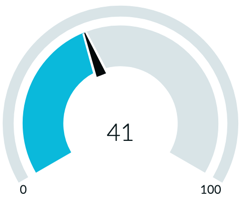
Under Display settings, choose 180 degrees as the gauge arc angle.
180 degrees shows the gauge as a semicircle. 240 degrees shows the gauge as three quarters of a circle.
| 180 degree gauge |
240 degree gauge |
 |
 |
-
Change the score size from the default M (medium) to L (large) to emphasize it.
-
Ignore the inner radius parameter for the purposes of this example.
The inner radius is the ratio of the visualization's inner radius to the outer. Allowed values are 0.7–0.95.
-
Under Ranges, choose the minimum and maximum values of the gauge.
The default values are 0 and 100. In this case, the minimum is zero if there are no open incidents. Keep the default value for the maximum as well, but consider realistic maximum values when you create your own gauge
visualizations.
-
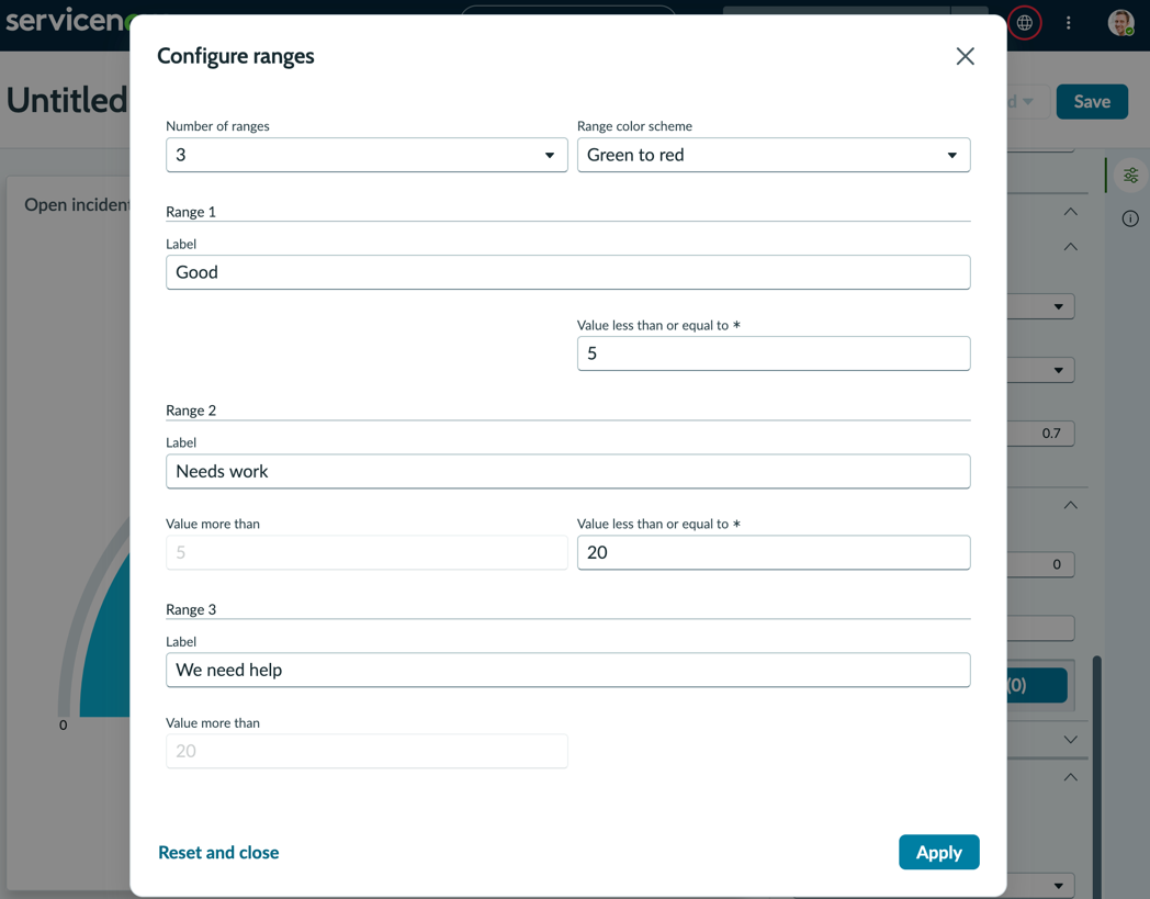
Select Configure ranges.
Ranges are the color bands that show how the value meets the goals associated with the visualization. For the purpose of this example, you configure three ranges to illustrate the value.
-
Keep the default number of ranges, 3, and the default color scheme of Green to red.
-
Label the first range Good and specify Values less than or equal to
5.
-
Label the second range Needs work and specify Values less than or equal to
20.
The lower value is taken from the first range.
-
Label the third range We need help.
The value of this range is taken from the second range.
-
Select Apply.
-
Configure the Labels for the gauge.
-
Choose the Score label None.
The other choices are Metric label and Range label. Because the metric is in the name of the visualization, it's redundant to label the value in the gauge with Incidents. The Range label provides the option to make the
label the visualization's primary text rather than the value.
-
Select Show range limit.
The range limit adds the lower values of each range, and the upper limit of the gauge to the visualization.
-
Select Show range labels.
The range labels that you configured add context for each of the ranges.
You've created three rules to show whether the single score value is in line with what you want to see.

결과
You've created a gauge visualization based on a single metric, open incidents. You've also configured user options regarding filters and drill downs, and configured the visualization's size, labeling, and ranges.