Compare performance metrics between two time periods to identify trends, anomalies, or changes in your ServiceNow instance behavior. This analysis helps you to know the impact of changes, troubleshoot issues, and understand performance patterns over time.
Before you begin
Role required: admin
About this task
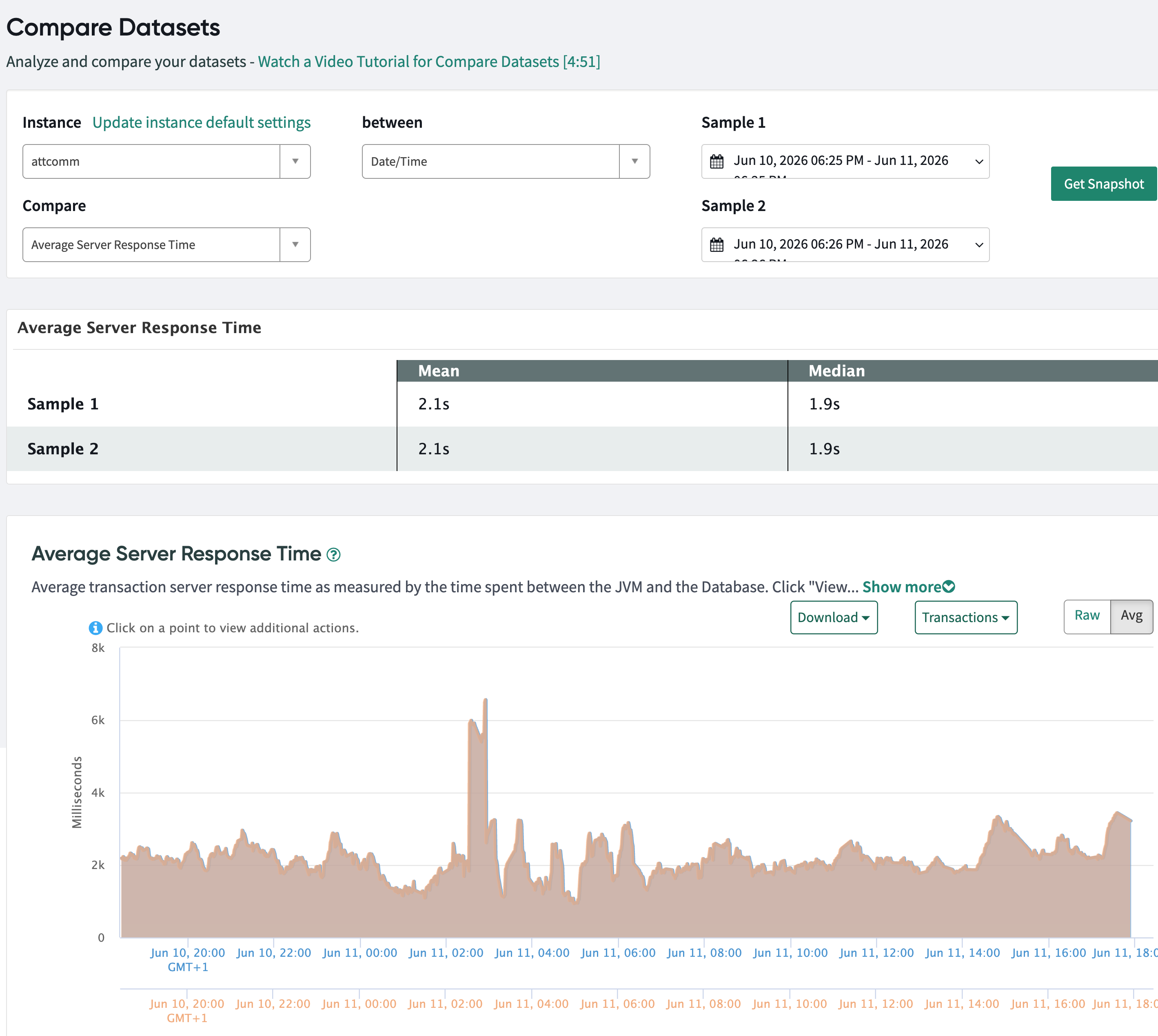
Use the Compare datasets tool to compare high-level metrics across time. It has different dimensions from which you can pick a dataset. For example, in the Average server response time, you can pick two days for about
three-hours period, and compare the overlays and analyze differences in performance metrics between the two time periods. This is useful to understand the impact of deployments, configuration changes, or identify performance
degradation over time.
Procedure
-
Navigate to .
-
Log in to IInstance Observer and navigate to .
-
In the Instance field, select the instance you want to analyze.
For example, select observability to analyze the observability instance.
-
In the between field, select the time range type for your comparison.
The default option is Date/Time, which allows you to specify exact date and time ranges for both samples.
-
In the Compare field, select the metric you want to compare.
For example, select Average Server Response Time to compare server performance between two time periods.
-
In the Sample 1 field, specify the date and time range for the first dataset.
For example, select
May 10, 2026 05:58 AM - May 10, 2026 08:58 PM to analyze data from May 10.
-
In the Sample 2 field, specify the date and time range for the second dataset.
For example, select May 12, 2026 05:58 AM - May 12, 2026 08:58 PM to compare against data from May 12.
-
Select Get Snapshot to generate the comparison.
The system displays a comparison of the selected metric between the two time periods, including:
- A summary table showing Mean and Median values for both samples
- A line chart visualizing the metric trends over time for both samples
- Moving average lines to help identify patterns and trends
You can use the Raw and Avg toggle buttons to switch between viewing raw data and averaged data in the chart.
-
Select the Compare field and select your preferred metric to compare the datasets.
- Average session summary enduser: The average time span of a user when they log in until their session ends.
- Average session summary loggedIn: Total session counts for non-active users.
- SQL Response Time: The smallest unit of measurement to track SQL per SQL statement. Tracks the average time (in ms) for SQL queries to execute against the ServiceNow database
If it deviates beyond 2.5 milliseconds, select Query Patterns, zoom into 15 minutes on each side of the spike analyze the graph and the dataset to understand the cause of the issue.
-
Select Releases option in the between list to compare the date ranges between two upgrades.
-
Select the releases from the two lists of the Select releases to generate dates for comparison.
-
Select Get Snapshot.
For one period, it picks the dates for you between the two releases that you're comparing in the
Using: section. When you select the

, the dates are selected for you to compare the datasets.