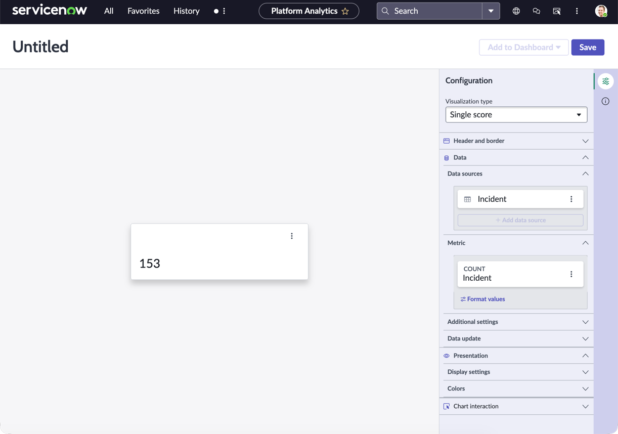
Use a single score visualization when you want to show a single value or metric, such as overall revenue or number of open incidents. The basic score visualizes a single value with a descriptive heading and
date/timestamp.
Before you begin
Role required: Anyone with access to data can create a visualization of that data on any dashboard that they can edit. Users with the itil, report_user, admin, or viz_creator role can create a visualization in
the Visualization Designer. When you create a visualization in the Visualization Designer, it is saved to the Library. For more information on access, see Report_view access control and Platform Analytics roles.
About this task
Single score visualizations have the advantage that you can color code them to show if the value is good for your business or requires improvement. For example, the number of open incidents is a value you want to keep low. Revenue, on
the other hand, you want to be high. Let's create a single score for open incidents.
In this example, you create a single score visualization that shows the number of open incidents and color code the visualization to highlight the value's desirability.
Procedure
-
Follow the first steps to Create a single score data visualization:
-
Navigate to , or open an in-line dashboard and select Edit.
-
Select Create data visualization.
-
From the Scores section, select the Single score visualization
type.
-
For the moment, skip the header and border section and move to the data source.
-
Select Add data source.
-
Choose the Incident [incident] table.
-
Because this visualization shows open incidents, let's add the Incidents.Open condition in the Filters section.
With this filter selected, the visualization only shows the number of active incidents.
- Optional:
Select Run to preview the records that the visualization will be based on.
-
Select Add this source.
A single score data visualization with the current value of the selected data appears in the
Visualization Designer.
-
Now that you can see the visualization, let's add some context for the user.
-
Expand the Header and border section.
-
Select Show header and provide the title Number of open incidents.
When Show header is selected, you can add a title and a description. The chart title isn't necessarily the same as the visualization name. The visualization
name identifies it in the Visualization Designer and in a list. The chart title appears within the visualization.
-
Enter a description of the visualization: Number of open incidents of all priorities and categories.
While the description and title fields aren't required, this information makes the visualization easier to understand on a dashboard and easier to identify in a list.
-
Skip over the Metric section.
Some data visualizations support multiple data sources, but the single score visualization doesn’t. Because we only want to see the number of open incidents, you don't need to change the default metric, Count, or its label,
Incident.
-
Under Additional settings, configure some extra information about the visualization.
-
Leave the Show metric label unselected.
Because the name of the visualization is Number of open incidents, the metric label, Incident, is redundant.
-
Select Show score update time.
Alone, this option shows the time of day the score was last updated. You can also select Use relative score time to show the elapsed time since the last update, for example just now, five minutes ago, and so
on.
-
Select Show zero.
In some cases, a value of zero isn't interesting to the audience of a visualization. In this case, however, you want to show off having zero open incidents.
-
Under Data update, configure how the audience interacts with the visualization.
-
Select Follow filters.
This option enables the visualization to follow interactive filters on the dashboards it's placed on that are based on the same table.
-
Select Show filter icon to show the number of filters applied to the visualization.
For example, if dashboard filters limit the value of the visualization, the icon indicates that you're seeing the number of open incidents that match the filters. You can then check to see which filters are in
effect.
-
Select Enable drilldown to let viewers navigate to relevant information by selecting a data point in the chart.
Some visualizations only drill down to the list of associated data. Table data is generally restricted by access control lists (ACLs) and viewers may not see all of the associated records.
This control mirrors
Allow chart interaction. Under Chart Interaction, you can also select the destination of drilling down.
-
Under Presentation, configure the size and base color of the score value.
-
Under Display settings, change the score size from the default AUTO to XL (extra large) to emphasize it.
-
Choose a Score icon and an icon style to distinguish this data visualization from others on the dashboard you add it to.
For example, select the Activity Outline icon with background.
-
Select the color type Single color.
-
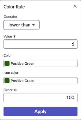
Configure a color rule for the score.
Because you want to emphasize the state of open incidents, define a dynamic color rule that changes the score's color based on its value.
-
In the Display settings, choose the Single color color type.
-
Under Color Rules, select + Add rule.
-
For the first color rule, choose the Operator
lower than, enter the Value
6, and choose the color Positive Green for both the color and the icon color, and select Apply.
The value is up to the specified number but not including it.
Retain the order 100.
-
To indicate a value that requires more attention, create a second rule with the Operator
between, the values 5 and 25, the color and icon color Warning Orange, and the order 50.
-
To show values that require the highest attention, create a third rule with the Operator
greater than, the value 25, the color and icon color Critical Red, and the order 25.
You've created three rules to show whether the single score value is in line with what you want to see.

-
Select Save.
Result
You have created a single score visualization based on a single metric, open incidents. You have also configured user options regarding filters and drilldowns, and configured a color, an icon, and coloring rules.